
I think that the number one aspect of a room makeover that people are always scared of is COLOR! Most people like to play it safe and keep things simple with white walls. They don't like to venture out into the wonderful and exciting world of COLOR! So, one of my words of wisdom is to break away from the drudgery of boring white walls and add some COLOR into your life! Don't run from it... run to it! Adding color to a room is by far the easiest and cheapest way to spice up a room and make some impact. Okay, so if you don't want to take a huge plunge into the color wheel and you'd rather take baby steps then even neutral based colors is a good start. Another way to ease into is to just paint one accent wall. So here is how you do it right!
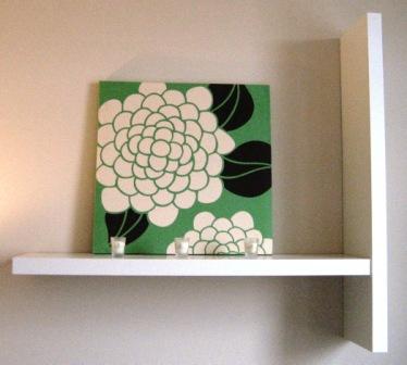
The secret to a good color combo is the 60-30-10 Rule. This means that 60% should be the dominant or base color, 30% the secondary color, and 10% an accent or "punch" color. Furthermore, when choosing the colors make sure to keep a couple of things in mind. First, pay close attention to the natural light coming into the room via windows. If you have a room with a lot of windows natural light will definitly make the colors look different when the natural light coming in is at its brightest or vice-a-versa. Secondly, be careful when working with dark paint colors because they make a room feel and appear smaller. If the room is already small to begin with, don't paint it dark because it will only make it feel even smaller! Finally, don't forget about the good ol' accessories and accent pieces that you already have, for example your favorite rug, artwork or pillow! Use these items as inspiration and encorporate them when choosing your color palette. A plus to this method is that it always saves money and it serves as a starting point for the whole design concept.

When choosing colors you also want to make sure that the colors reflect the overall ambience and emotional impact that you want to set for the room. If you want to make the room a serene and subdue place to read and take naps in, you don't want to choose lively colors like bright red or hot pink. Instead, you'd want to stick to earth tones like fall colors and blues.
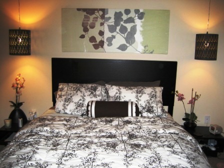
So, once you have the 3 colors picked out you want to make sure you know where to put them. This is when you want to think "vertically." Use darker colors for the floor, medium values of colors for the walls, and the lighter colors for the ceiling. This really makes a space look cohesive and as if the colors really do belong together. Also, don't forget to think back to the 60-30-10 Rule. Lets say that you choose an off white shade, an olive green color, and a dark grey for your palette. The medium value shade, olive green, will be the wall paint color. The dark grey will be encorporated into a large floor rug and window treatments. The final off white color, of lightest value, will be appear on the ceilings and perhaps in other accent pieces such as bed linens or pillows.
So, once you have the sometimes daunting task of picking 3 colors out of the thousands of options your job isn't quite done yet. Color placement is crucial to the finished makeover results. If you have the colors but don't know what to do with them then you haven't made much progress. Thus, always be very careful when designating the 3 colors their positions in the space.


No comments:
Post a Comment